Auberge de Mon Petit Chum
In this case study, my team collaboratively designed a strategic communications campaign and website for a small Bed & Breakfast, located in Wakefield, Quebec.
In this case study, my team collaboratively designed a strategic communications campaign and website for a small Bed & Breakfast, located in Wakefield, Quebec.
Team Members: Kathryn Barry, Paige Gryski, Jordan Leach & Anthony Sanchez
Role: UX Project Lead & Developer
Tools: Adobe Illustrator, Adobe XD & WordPress
Timeline: 14 Weeks
You can view the complete Situation Analysis in the final Campaign Document
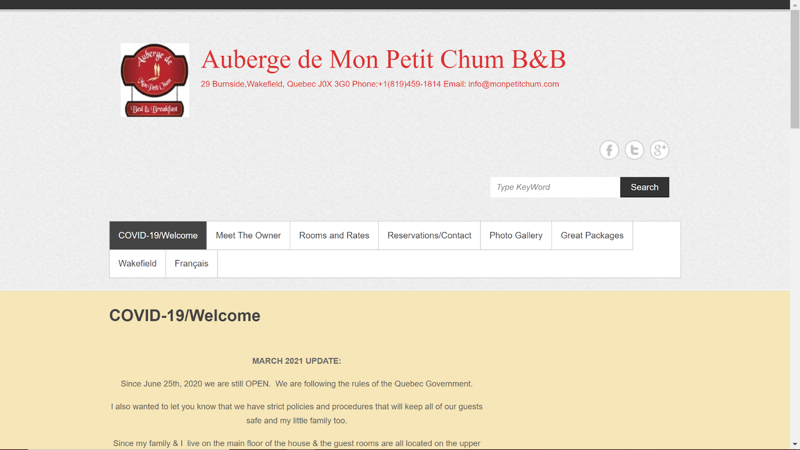
Auberge de Mon Petit Chum is a small bed and breakfast located in Wakefield, Quebec. Dawn, the owner, provides a highly personalized experience for her guests to make them feel at home. Some of her services include a complimentary homemade breakfast and packages for guests looking to explore some of the activities in and around Wakefield.
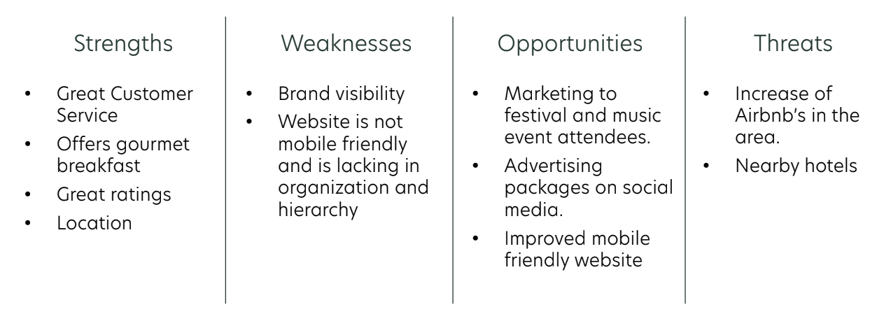
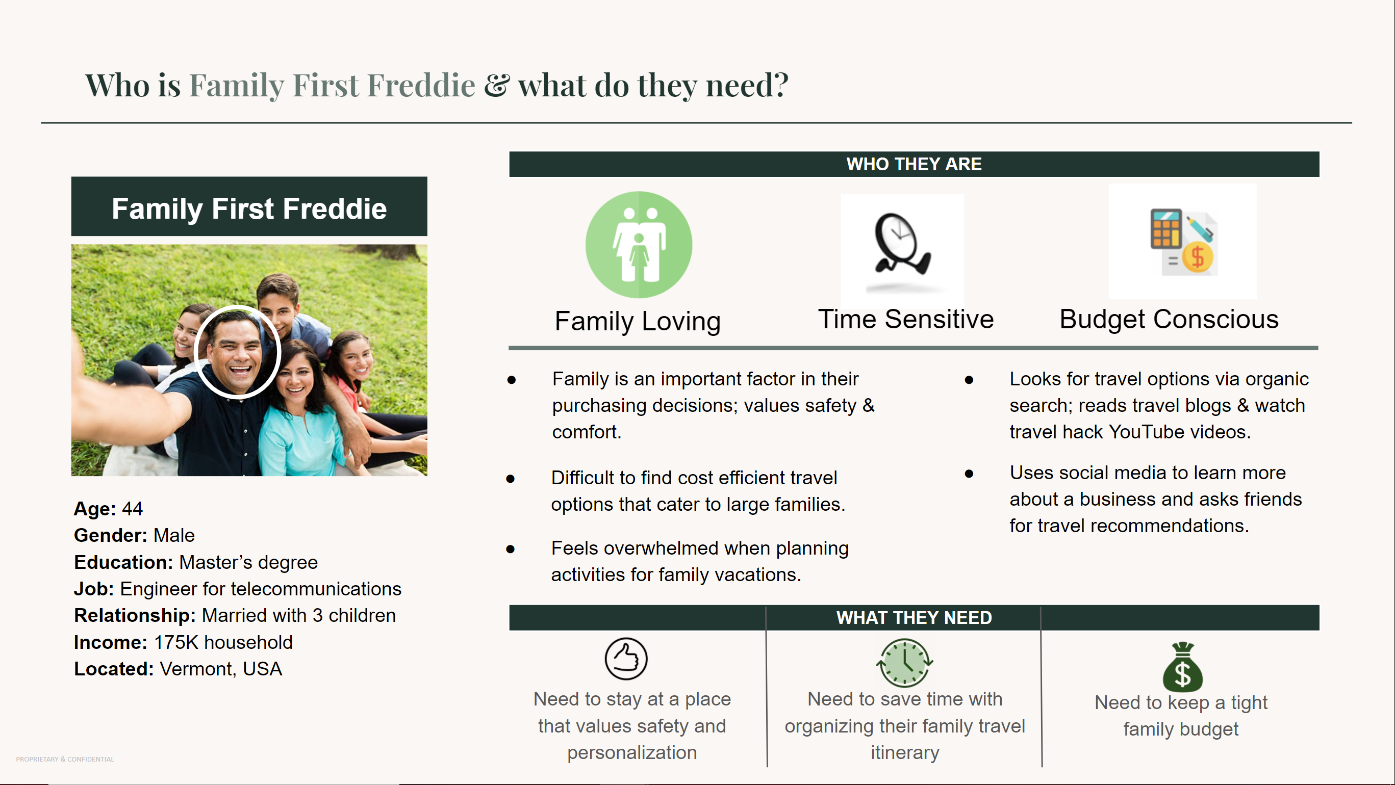
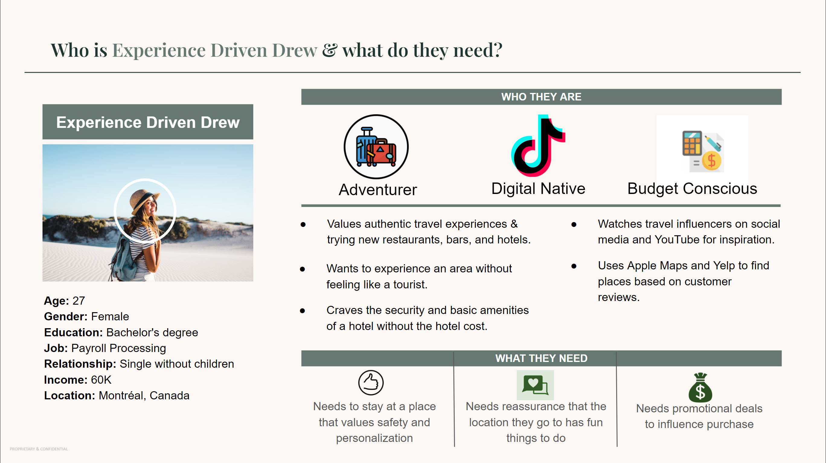
Show customers how, in a sea of lookalike accommodation options, Auberge de Mon Petit Chum delivers a unique authentic travel experience in the heart of Wakefield for travelers who value comfort, cost, authenticity, and a touch of personal flair.
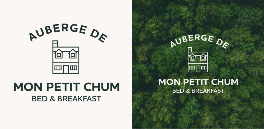
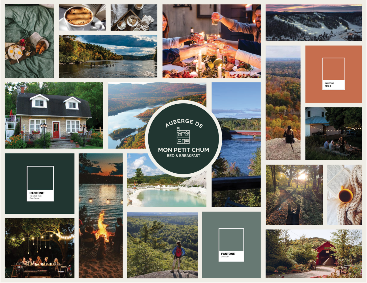
Color: Green to represent new beginnings, growth, and the Wakefield scenery.
Logo: Focused on the home & nestled in the center for safety
Imagery: Showcase the beauty of Wakefield.
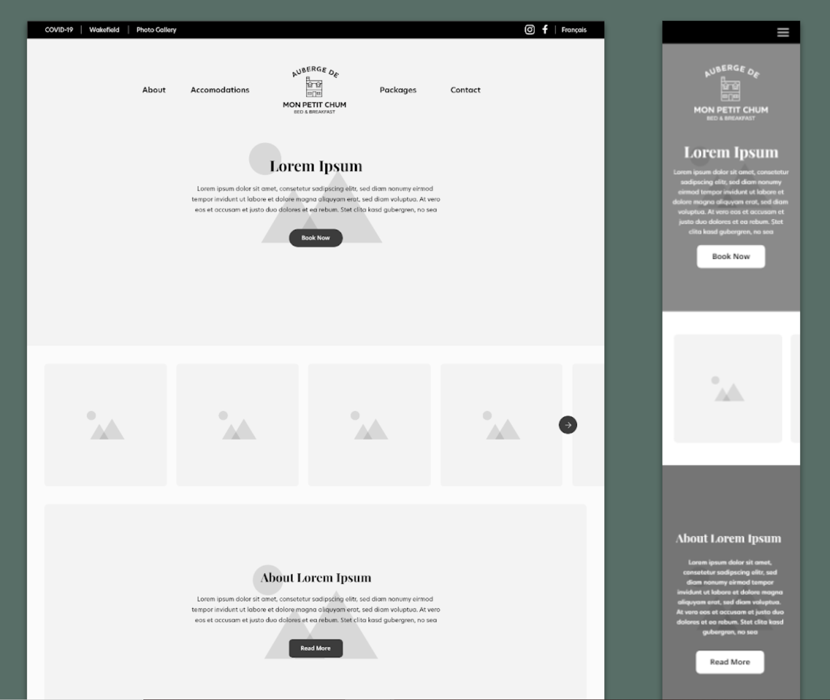
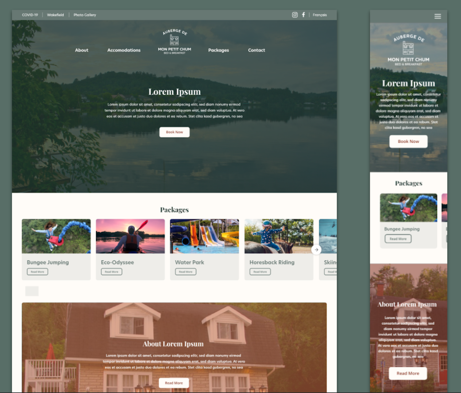
User testing was conducted using a live prototype of the website with 6 users.
A few of the issues identified:
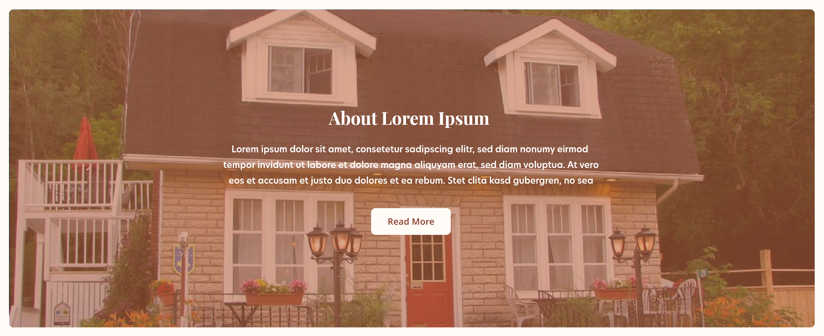
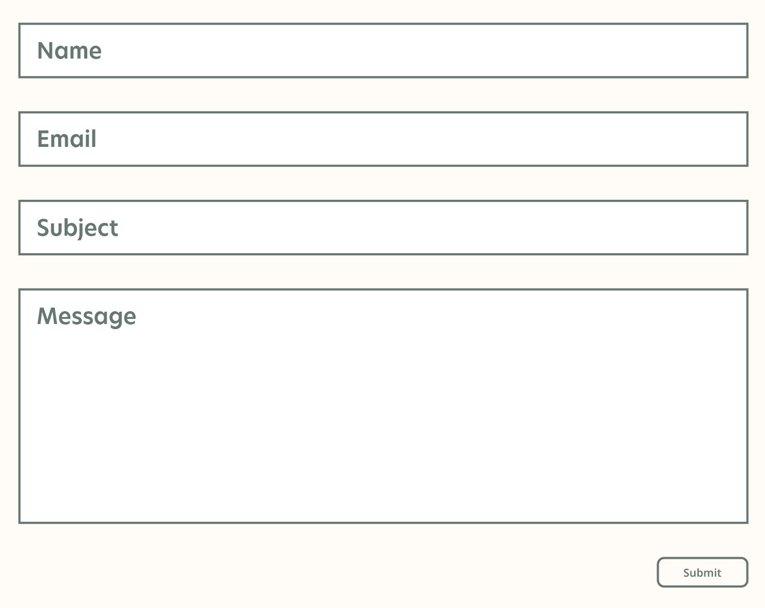
Modifications made based on user feedback:
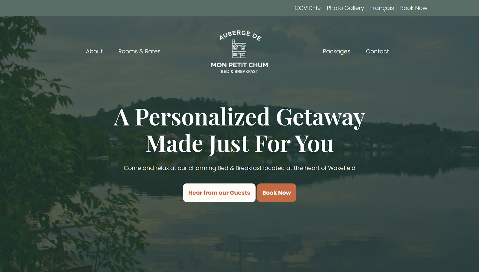
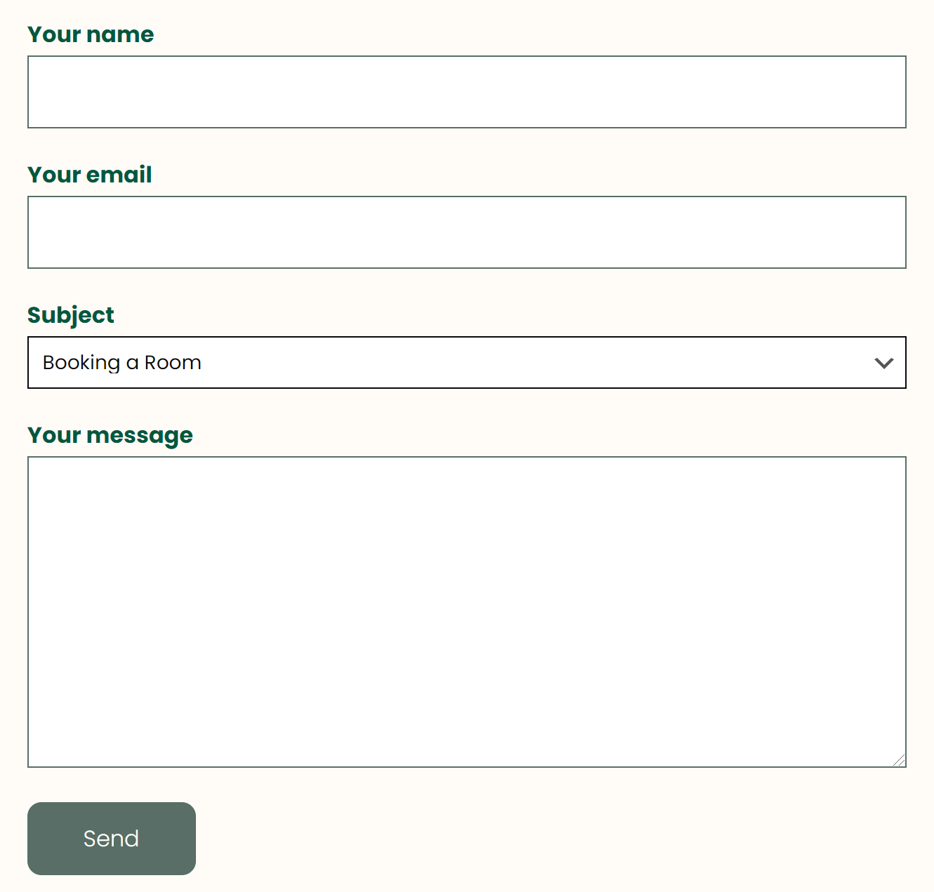
The time constraints of the due dates for specific deliverables prevented us from being able to conduct testing on our mockups. Conducting testing of our live prototype/website rough draft then limited our ability to make changes. With the time constraints given, it would have been beneficial to at least test our wireframes with users to get feedback earlier in the process.